Wednesday, 27 November 2013

T.A.S.K. by R. Williams - Part 2: Character Movement

Pages 102 - 166 'Walks'

A walk is the first thing to learn. Learn walks of all kinds, because walks are the toughest things to do correctly.

Walking is a process of falling over and catching yourself just in time. We're going through a series of controlled falls.

Usually we lift off the ground just the bare minimum, which is why it's easy for us to stub our toes or trip over.

All walks are different, no two people in the world walk the same. Everyone's walk is as individual and distinctive as their face, and one tiny detail will alter everything.

Women mostly walk with their legs close together, resulting in not much up and down action on the head and body.

Men walk with their legs apart so there's a lot of up and down action with each stride.


Getting The Weight

It's the up and down position of your masses that gives the feeling of weight.

It's the down position where the legs are bent and the body mass is down where we feel the weight.

This is what happens in a so-called 'normal' walk:

 First we'll make the 2 contact positions. In a normal, conventional walk, the arms are always opposite to the legs to give balance and thrust.


Then we put in the passing position and because the leg is straight upon the passing position, it will lift the pelvis, body and head slightly higher.


Next comes the down position, where the bent leg takes the weight.  In a normal walk, the widest arm swing is on the down position.


Next comes the down position, where the bent leg takes the weight.  In a normal walk, the widest arm swing is on the down position.


It becomes more clear when spread out and exaggerated.


Set The Tempo

The first thing to do in a walk is set a beat. Generally, people walk on 12's - march time (half a second per step, two steps per second.)


Lazy animators don't like to do it on 12's, as it's hard to divide up; instead, do it on thirds.


Have the character walk on 16's or 8's, as they are easy to divide up.


We set a beat:


4 frames = A very fast run (6 steps per second)

6 frames = A run or  very fast walk (4 steps per second)
8 frames = Slow run or 'cartoon' walk (3 steps a second)
12 frames = Brisk, business-like walk (2 steps a second)
16 frames = Strolling walk - more leaisurely (2/3 of a second per step)
20 frames = Elderly or tired person (almost a second per step)
24 frames = Slow step (one step per second)
32 frames = ...'Show me the way... To go home'...

The best way to time a walk (or anything else) is to act it out yourself and time it with a stepwatch.


The Passing Position or Breakdown


There's a simple way to build a walk. Start with just 3 drawings. Our two contact positions, and then put in a passing position.


This time it's raised higher than before, making it the 'up position', and the contacts will act as the low.


When we make the character go down on the passing position, it becomes a 'cartoony' walk, the passing position acting as the low and the contacts as the highs.


The crucial thing is the middle position and where we put it. Changing the middle position can give the walk a whole new feeling.
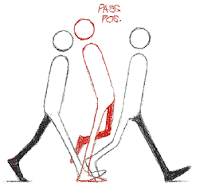


We don't have to stick to the same shape, there are things that can be done by changing mass.


How about a heavier man with a pot on him: instead of raising the whole body on the pass position, we can stretch it, giving flexibility.


Or conversely, squash it, giving more flexibility within the walk. Keep the pelvis level throughout.

We can also keep on breaking things down into weird places, provided we allow enough screen time to accomodate the movement. Changing what happens on the inbetween positions can make the walk very different. You could make the character go down to take the weight, whilst still going higher on the push off.
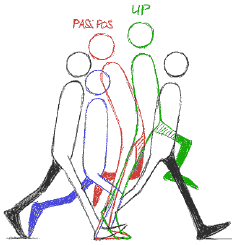
 

Putting the down where the up would normally be and bending the leg, then where the down position was, put a straight inbetween but delay the leg for balance. This gives an interesting walk. 


The Double Bounce

The double bounce walk shows energetic optimism - the North American 'can do' attitude.

The idea is 2 bounces per step, you go down (or up) twice instead of once each step.

The pass position is down instead of straight, so the character bobs  up and down as he goes.


Weight Shift

The weight shifts from one foot to another in a normal stride. Each time we raise a foot it thrusts the weight of our body forward and to the other food.


The shoulders mostly oppose the hips and buttocks.

For fatter, more 'cartoony' characters, you can exaggerate the weight shifting.


The Belt Line

Tilt the belt line back and forth favouring the leg that is lowest.

Normally the belt line is down with the foot that is down, and up with the food that is up.


Also, the shoulder normally opposes the pelvis, but we can do what we like.


Pages 167 - 175 'Sneaks'

There are 3 definite catergories of sneaks:


The traditional sneak has an average of 24 frames for each step, and a fast version is 16 frames per step, with a slow version being 32 frames per step.

The three main things are:

  • The body goes back and forth, the body goes back when the foot goes up. The arms are used for balance.

  • When the foot reaches and contacts the ground, the body is still back and the head is held back, delayed just a bit.

  • After the foot contacts the ground, the body follows - going forward as the foot takes the weight. Next, the body will go back as the other foot goes forward.


For a slow sneak, the arms don't oppose the legs, they just balance (generally little action happens in the arms and hands). 

It's a good example of counteraction. As he moves along, the head goes forward and the hands go back.


Pages 176 - 216 - 'Runs and Jumps and Skips'

In a walk one foot is always on the ground, and only one foot leaves the ground at a time.


In a run, both feet are off the ground at some point for 1, 2 or 3 positions.

You only have to lift both feet off the ground for one pose to make it into a run.

The same thing can be done with more 'cartoon' proportions, with the feet off the ground for 2 positions, plus violent arm swings.


There is also the 'real' version of the same walk, with reduced arm action, hardly any up and down on the body, plus both feet are off the ground for 2 frames.


With walks, we can curve the body. Reverse it on the opposite step and keep it straight on the pass position.

We can't do as much as with walks, as we don't have as many positions because of the run is faster.


In a fast run #5 should not be exactly the same silhouette as it's counter, #1. Vary it, make it higher or lower. The positions should also overlap slightly to help carry the eye.


In reality the faster the figure runs, the more it leans forward.

We can take things much further with animation, leaning the body all the way forwards.


It's a good idea to vary the silhouettes on a fast run, so that the eye doesn't read it as just the same one leg and one arm going around.


T.A.S.K. by R. Williams - Part 1: History and Principles

I've recently read through The Animator's Survival Kit, a book which covers a lot of topics surrounding animation. Although the book mainly talks about 2D animation, a lot of the theories and principles apply to 3D as well. I will write a quick paragraph about the unimportant chapters, and go into more depth with subjects with will help me more with my dissertation.

Because each of the blog posts are quite long, I've split them into different posts to make it easier to read and find specific notes in future. I've given each of the posts a different heading to describe what is talked about in each.


Pages 1 - 40


Williams talks his career and experience with animation, and how he feels that it's important for animators to have good drawing ability; though he specially states that 3D animators don't necessarily need to have good drawing abilities, it does help to have a good understanding of anatomy and mass.


He suggests doing a lot of life drawing, which with time, can make even the most inexperienced of artists capable of drawing advanced creatures and scenery. Although I already have some basic drawing skills, I have taken his advice and have started doing some simple life drawings, and will continue to do so when I find the spare time.


Pages 41 - 83


Most of these chapters talk about how the 2D animation industry works, as well as the timeline of work and demands of employers. There is a lot of information about how to cut time using in-between frames and creating charts to explain what needs doing to assistants, who can fill in the unimportant drawings whilst the main animator works on the 'extreme' poses. Though very interesting, a lot of the information doesn't apply to 3D animation.


Pages 84 - 101 'More on Spacing'


This chapter starts to get more relevant to my work, so I'll make some notes below.


Classic Inbetween Mistakes


Richards writes about how 'inbetweeners' (frames which are not main poses) are often not done correctly. When making an inbetween frame, one should be able to understand and complete eccentric actions such as anticipation. 


Watch Your Arcs

Most actions follow arcs, and generally an action is an arc. Arcs are usually wavelike or go in figure 8s. Sometimes arcs are angular or straight. Straight lines give power.


The arc of the action gives us the continuous flow, and the bones don't shrink and grow as they move - they maintain their length.


It all seems quite simple, but when we deal with sophisticated images and actions it can all go wrong.


Richards talks about a Hollywood assistant who was having trouble making a realistic horse animate correctly, and after looking closely at the arc of the eye, the problem became obvious.


Everybody thinks they know the bouncing ball example, but swap the ball with a heavy billiard ball, and it won't bounce. Balls also wouldn't slow down as they fall, they speed up.


Getting More Movement Within the Mass


This chapter is about finding ways to get movement within movement, getting more 'change', more bang for the buck.


To exaggerate a hit, such as a creature shooting through the air into a cliff, one could make sure he makes contact with the cliff before suddenly slamming into it. One could also stretch the creature before it touches the cliff, giving a stronger impact to the hit.


Take The Long Short Cut

The long way turns out to be shorter, because something usually goes wrong with a short cut, and it turns out to take even longer trying to fix everything that went wrong. It's quicker to just do the work.

With animation, you have to be very specific. If a drawing is out of place, it's just wrong - clearly wrong- as opposed to 'Art' or 'Fine Art' where everything is amorphous and subjective.

It's obvious to us whether our animation works or not, whether things have weight, or just jerk about or float around wobbling amorphously.

There's nothing more satisfying than getting it right.

Tuesday, 19 November 2013

Proposal Marksheet Feedback

After receiving the feedback from the Dissertation Proposal, I feel that I should use this opportunity to answer some questions about it as well as discussing where I should go from here.

The first issue to tackle is that the elements that are being marked are not made clear. This is an issue I talked about very briefly at the start of the proposal, stating that I will only focus on the animations. That being said, I didn't mention the things that I wouldn't be animating, such as environments, models, textures, etc.. I will use a free, open-source rig from the internet (such as the ones exampled on this blog), and I do not plan to do any texturing or other work on the rig. As for the environment, I'm planning to stick to simple shapes (cubes, spheres, cylinders) for different surfaces and objects for the character to interact with; although I do not plan to be marked on texturing for the environment, I may put some simple patterns onto surfaces in order to easily distinguish them from the character.

The timeline is generic, but until I've done my storyboard, it's hard to know what needs animating. In hindsight, I feel that I should have allocated more time to planning the actual story, but I was told early on that the story isn't what's important, but the skills being demonstrated, so I ended up focusing on learning how to animate in Maya. As it stands right now, after exporting a very short animation from Maya, I can say is that most of the time will be dedicated to animating the character (which is extremely vague right now), and I can also safely assume that I will need at least 2 - 4 weeks to get the cameras set up correctly and render the final project.

I plan to make my storyboard very soon, which will give a clearer indication of how long each part of the animation will take. Until then, all I am certain of is that I will animate only the humanoid character, I will use simple directional lighting on the whole scene, and will export the animation as a 720p PNG image sequence into Sony Vegas, then convert it to a WMV or MP4 file. Without the storyboard it's also hard to know exactly what camera angles I will need to use, but I've animated cameras in 3DS Max in the past, and considering how easy I found it, I think the same ease will apply in Maya.

After recently trying to animate a face in Maya, it's actually a lot easier than I originally assumed. I therefore feel that including expressive facial animation is a good idea, but that I should do a little more research focused on it first.

Right now the next step forward is to draw out my storyboard, and then I can hopefully update my blog with a more acturate timeline.

Monday, 11 November 2013

Another test animation

Using the Max rig in Autodesk Maya, I've made a silly animation to test out the leg, arm and face movements. It took a while to get started, but after a while I got the hang of it.


Next I want to work on slightly more realistic movements for the body and arm, and use the graph editor to smooth out every part of the animation.